Here is what you know about the art of typography in design and how it influences effective visual communication.
The art of typography holds a profound influence on visual communication, brand identity, and user experience. Typography, as a fundamental element of design, encompasses the deliberate arrangement of type to convey meaning, evoke emotions, and guide the viewer’s attention. This art form encompasses the selection of typefaces, font sizes, line spacing, and alignment to create visually compelling and impactful content.
Table of Contents
1. Establishing Visual Hierarchy

Typography plays a critical role in establishing visual hierarchy within design. By varying typefaces, sizes, and styles, designers can guide the audience’s attention and emphasize key content. Take, for example, a magazine cover where the bold and enlarged title commands immediate attention, followed by the subtitle and supporting text. This deliberate use of typography creates a structured flow of information, ensuring that the most important elements stand out while maintaining visual harmony.
- Font Size and Weight: Typography plays a crucial role in establishing visual hierarchy by utilizing variations in font size and weight. Larger and bolder typefaces naturally draw the viewer’s attention, making them ideal for headlines and key messages. In contrast, smaller and lighter fonts are often used for secondary content, creating a clear distinction in importance within the design.
- Contrast and Alignment: The strategic use of contrast and alignment in typography contributes to visual hierarchy. By juxtaposing different typefaces, sizes, and alignments, designers can create a sense of order and emphasis within the layout. For instance, aligning text to a grid and juxtaposing serif and sans-serif fonts can effectively guide the viewer’s eye through the content, establishing a clear visual hierarchy.
- Whitespace and Proximity: The use of whitespace and proximity in typography is instrumental in establishing visual hierarchy. Ample whitespace around important text elements can draw attention to them, while grouping related content closely together can signify their interconnectedness. By leveraging these principles, designers can create a balanced and harmonious visual hierarchy that enhances the overall readability and impact of the design.
2. Conveying Brand Identity
The significance of typography in brand identity cannot be overstated. Consider the iconic “Coca-Cola” logo, where the distinctive cursive script embodies the brand’s heritage, warmth, and familiarity. The choice of typography becomes synonymous with the brand itself, evoking emotions and associations that resonate with consumers. Similarly, the sleek and modern typography of Apple Inc. reflects the brand’s minimalist ethos and innovative spirit. These examples showcase how typography serves as a powerful vehicle for expressing and reinforcing brand identity.
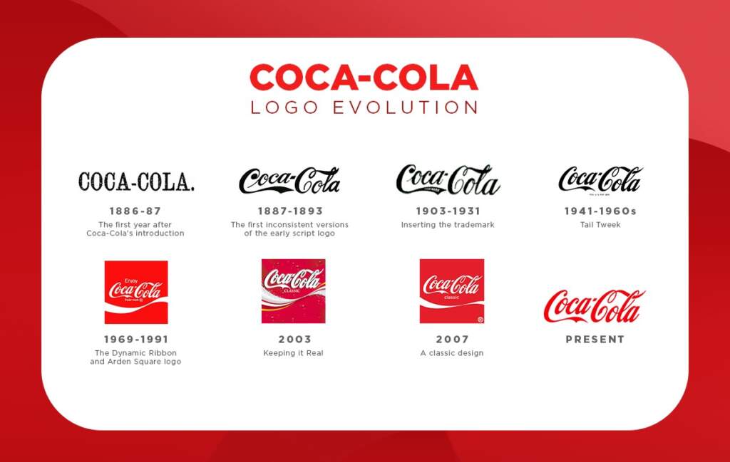
- Reflecting Brand Personality and Values: Typography serves as a powerful tool for conveying brand identity by reflecting the personality and values of a brand. For instance, a luxury brand may opt for elegant and sophisticated fonts to align with its upscale image, while a fun and playful brand might choose bold and colorful fonts to resonate with its vibrant identity 1.
- Eliciting Emotions and Aligning with Brand Tone: Different typefaces possess distinct characteristics that can align with a brand’s values and tone, allowing typography to evoke emotions and convey a brand’s personality. For example, a bold and modern typeface may be suitable for a technology-oriented brand, while a classic and elegant typeface may be more appropriate for a luxury brand, thereby reinforcing the brand’s identity and resonating with its target audience 2.
- Consistent Typeface for Visual Recognition: By using a consistent typeface across all brand assets, a brand can establish a visual identity that is easily recognizable to consumers. This consistency in typography ensures that the brand’s logo, website, and marketing materials convey a harmonious and cohesive message, contributing to brand recognition and reinforcing its identity 3.
3. Eliciting Emotional Responses
Typography has the ability to evoke emotions and set the tone of a design. For instance, the use of elegant and flowing script fonts in wedding invitations creates a sense of romance and sophistication, aligning with the emotional nature of the event. In contrast, the bold and angular typography in a sports apparel brand’s logo exudes energy and dynamism, resonating with the brand’s target audience. These examples illustrate how typography functions as an emotional trigger, influencing how individuals connect with and interpret visual content.

- Cultural and Geographical Variations: Research indicates that the choice of typeface plays a crucial role in eliciting emotional responses, with preferences and impacts varying significantly depending on cultural contexts and geographical locations. This suggests that typography can evoke different emotional reactions based on cultural associations and regional nuances 1.
- Brand Marketing and Emotional Connection: Typography is a key element in brand marketing strategies aimed at eliciting emotional responses from the audience. By leveraging text, images, and design elements, marketers aim to create a personal connection that resonates with the emotional needs of potential buyers, highlighting the role of typography in influencing emotional responses within marketing efforts.
- Emotion in Advertising and Design: Typography plays a pivotal role in advertising by serving as a conduit for emotional connections. Emotions are considered the secret sauce in advertising, transforming messages into memorable experiences. Authentic storytelling, relatable characters, and genuine narratives are emphasized as key elements in eliciting emotional responses effectively, underscoring the importance of typography in creating genuine emotional connections with the audience 2.
4. Enhancing Readability and Accessibility
In the digital landscape, readability and accessibility are fundamental considerations in design.
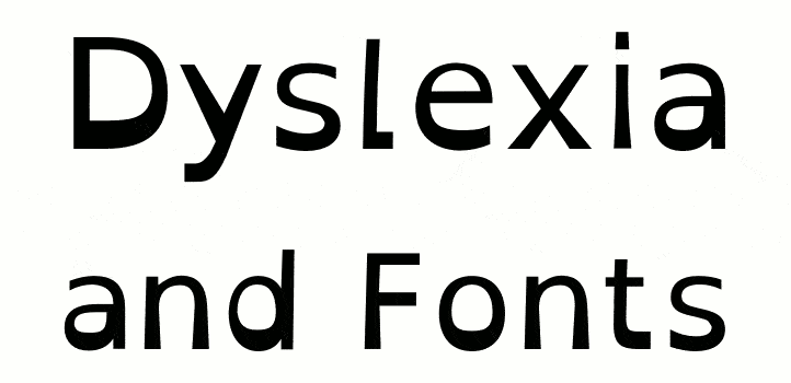
- Readability and Accessibility: Typefaces, font sizes, and spacing directly impact content legibility in digital design.
- Dyslexie Typeface: The “Dyslexie” typeface is designed to improve readability for individuals with dyslexia, demonstrating typography’s role in enhancing inclusivity.
- Promoting Inclusivity: Thoughtful typography application, such as using the “Dyslexie” typeface, promotes equal access to information and inclusivity in digital content.
5. Guiding User Experience:

Typography is integral to user experience design, particularly in digital interfaces. Consider a well-crafted website where clear and consistent typography enhances the readability of content, guides users through navigation, and contributes to an intuitive browsing experience. Through the strategic use of typography, designers can create seamless and engaging user interactions, ultimately shaping the overall user experience.
Conclusion:
In conclusion, the role of typography in design is instrumental, influencing visual hierarchy, brand identity, emotional resonance, readability, user experience, and search engine optimization. Through the examples presented, we have witnessed how typography serves as a dynamic and expressive tool, shaping meaning, identity, and user engagement within design. By recognizing and harnessing the power of typography, designers can craft compelling visual narratives that resonate with audiences and leave a lasting impression.
If you ever find any problem, or issue with a download file, or just want to reach out to say hello, we are always available at figmaui4free@gmail.com – Our team will be happy to help you.

